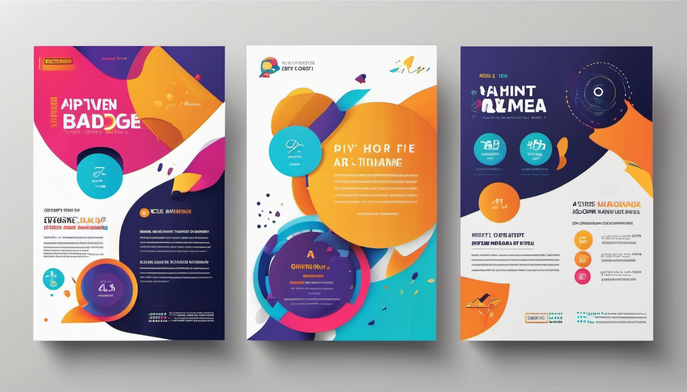
In the world of graphic design, particularly in poster creation, color plays a pivotal role. It’s not merely about choosing hues that look aesthetically pleasing; it’s about understanding the science behind color contrast to create visually compelling and effective designs. Color contrast is more than just selecting colors that stand out; it involves careful consideration of how different colors interact with each other and how they affect the message and readability of the poster. Let’s delve into the intricacies of color contrast in poster design and explore why it’s essential to create event poster for creating impactful visuals.
Understanding Color Contrast
Before diving into the nuances of color contrast, it’s crucial to comprehend the basics of color theory. Colors are not isolated entities; they interact with each other in various ways, creating contrasts that can either enhance or detract from a design’s effectiveness.
The Color Wheel: A Designer’s Guide
The color wheel serves as a fundamental tool for understanding color relationships. It consists of primary colors (red, blue, and yellow), secondary colors (green, orange, and purple), and tertiary colors (a mix of primary and secondary colors). By familiarizing oneself with the color wheel, designers can explore complementary, analogous, triadic, and other color schemes to create harmonious or striking contrasts in their designs.
Contrast in Design
Contrast refers to the distinction between elements in a design. In the context of color, it involves juxtaposing different hues, values, or saturations to create visual interest and hierarchy. For example, contrasting vibrant, warm colors may exude energy and excitement, while subtle contrasts of cool tones can evoke a sense of calmness or serenity. Effective use of contrast can guide the viewer’s eye, highlight important information, and evoke certain emotions.
Importance of Color Contrast in Poster Design
In poster design, where the goal is to capture attention and convey a message quickly, color contrast plays a critical role. Here’s why it’s essential:
Grabbing Attention
In a sea of visual stimuli, posters need to stand out to attract viewers’ attention. Strategic use of color contrast can make a poster instantly eye-catching, drawing viewers in and prompting them to engage with the content.
Enhancing Readability
Clear communication is vital in poster design, whether it’s promoting an event, conveying information, or advocating for a cause. Proper color contrast ensures that text and graphics are easily readable, even from a distance, preventing viewers from struggling to decipher the message.
Conveying Mood and Tone
Colors evoke emotions and associations, influencing how viewers perceive a message. By leveraging color contrast, designers can evoke specific moods or convey the intended tone of the poster. For example, contrasting vibrant, warm colors may exude energy and excitement, while subtle contrasts of cool tones can evoke a sense of calmness or serenity.
Principles of Color Contrast
Achieving effective color contrast requires an understanding of various principles and techniques. Let’s explore some fundamental concepts:
1. Hue Contrast
Hue contrast involves using different colors to create visual interest and separation between elements. Designers often leverage complementary colors (those opposite each other on the color wheel) to achieve maximum contrast and make elements stand out.
2. Value Contrast
Value refers to the lightness or darkness of a color. High-value contrast between elements, such as dark text on a light background or vice versa, enhances readability and ensures that information is easily discernible.
3. Saturation Contrast
Saturation refers to the intensity or purity of a color. Contrasting saturated colors with desaturated ones can create dynamic visual effects and draw attention to specific elements within the poster.
4. Size and Scale
In addition to color, the size and scale of elements contribute to contrast. Larger elements naturally command more attention, but strategic use of color contrast can further emphasize hierarchy and importance within the design. By familiarizing themselves with the color wheel, designers can explore complementary, analogous, triadic, and other color schemes to create harmonious or striking contrasts in their designs.
Practical Tips for Using Color Contrast in Poster Design
Now that we’ve covered the principles of color contrast, let’s explore some practical tips for incorporating it effectively into poster designs:
1. Limit Your Palette
While it may be tempting to use a wide array of colors, limiting your palette to a few carefully selected hues can create more impactful contrast and maintain visual cohesion.
2. Test for Accessibility
Consider the accessibility of your design by ensuring sufficient contrast between text and background colors. Tools like color contrast checkers can help identify any readability issues, particularly for individuals with visual impairments.
3. Use Color Psychology Wisely
Understand the psychological associations of different colors and use them strategically to reinforce the message or mood of your poster. For example, contrasting vibrant, warm colors may exude energy and excitement, while subtle contrasts of cool tones can evoke a sense of calmness or serenity.For example, red may signify urgency or passion, while blue conveys trust and stability.
4. Experiment with Typography
Incorporate contrast not only through color but also through typography. Pairing bold and thin fonts or mixing serif and sans-serif typefaces can create visual interest and hierarchy within the poster.
Conclusion
Color contrast is a powerful tool in the arsenal of poster designers, enabling them to create visually striking and effective compositions. By understanding the principles of color theory and applying them thoughtfully, designers can grab viewers’ attention, enhance readability, and convey messages with clarity and impact. For example, contrasting vibrant, warm colors may exude energy and excitement, while subtle contrasts of cool tones can evoke a sense of calmness or serenity. Whether promoting events, sharing information, or advocating for causes, mastering the science of color contrast empowers designers to create posters that captivate and communicate effectively.
In the realm of poster design, color contrast reigns supreme, dictating the success and impact of a visual message. By harnessing its power, designers can craft posters that not only catch the eye but also resonate with the audience on a deeper level.
So, the next time you embark on a poster design journey, remember the science of color contrast—the key to unlocking the full potential of your visual creations.


